Visual aids for speech and presentations are used by most presenters. Last month we talked about PowerPoint Templates and how they were wonderful at keeping things consistent – provided the template was well-formed. This month, I’d like to challenge anyone who fires up a PowerPoint deck (or Keynote, Impress, Prezi, or self-coded text editor presentation tool) on the purpose of their visual aids. I think misunderstanding the different functions of presentation assets causes most of the problems we see on the presentation platform as it relates to visuals and using visual aids for speech.
Problems with Visual Aids for Speech and Presentations:
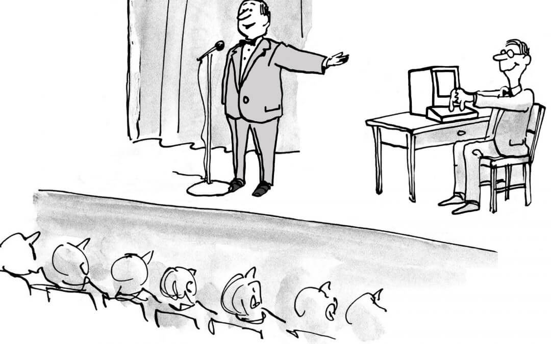
- The biggest complaint about PowerPoint (see Dave Paradi’s survey) has always been “The speaker read the slides to us.” Dave has been doing his survey for 16+ years, and it’s been number one that entire time. Apparently, everybody hates to be read to and no one is doing anything about it.
- Despite promises of the paperless office and the Green Movement to save expendable resources, there are still WAY too many presentations that are printed out, with notes in tow, and just passed around to audiences at sales pitches, conference presentations, and even weekly updates. I know from observation (and personal experience) that these paper decks are rarely kept for reference, but they do fill up recycle bins at an alarming rate.
- The slides that are created are often boring, trite, predictable, and distracting. All the things we say we want to avoid as presenters. The PowerPoint tool itself isn’t the problem, but it doesn’t solve the problem, either. PowerPoint doesn’t bore audiences; presenters do.
Our first step is to change the way we think about slides. The question I like to ask that cuts right to the point: “Are you there to help the slides, or are the slides there to help you?” Put another way, if we hire the best voice in the world – I’d pick James Earl Jones (JEJ) – to read your presentation (slides?) would it be better or worse? If JEJ is a better fit, then you are but an assistant to the real star – your slides. And that means you’ve just declared that you are expendable, and not even the best choice to be on the stage.
But I assume you ARE the best choice. You have experience, insight, and the will to change your audience. Let’s see what your slides are likely not helping.
I often ask our coaching clients, “How long did it take you to learn what you know about this topic?” Answer could range from a few months to a few decades. Regardless, it’s easy to convince you that you can’t bring your audience to your level in 50 minutes. So what DO you want to share? That’s worth figuring out. And since people aren’t likely to retain more than a few points at best, your presentation will be inefficient. But there is a way to get folks to retain more. It’s called motivation. Motivation to do some research. The motivation to read. And the motivation to get better. If we can inspire and pique their curiosity, the information is available. And if we help them by making it readily available (as in, we give it to them), all the better.
We’ve just entered the realm of handouts. Handouts allow the audience to follow along better, knowing the key points are retained for later. It allows for additional information, as well as items that are difficult to talk about or show (like URLs) to be passed on easily. And they are available long after you’re done talking. Handouts are great for the moment to take notes and to keep for later to provide insight. Handouts are awesome, and I rarely speak without providing a one-pager to my audience.
But a printout of PowerPoint is almost never a good handout. It’s just not designed for that.
Visual aids for speech and presentations have a – very important – place for the presenter. But that place is to help the message get across as simply and clearly as possible. If the visual isn’t helping the message, it shouldn’t be there. But a visual is only good in the moment. Once the projector is off, it serves no purpose. Many of the visuals I use are to drive an emotional response through pictures or to help people remember the structure of our key points by showing progress. That isn’t necessary when the presentation is over, and it’s one reason I never send an audience my slides. They aren’t any good to them after the fact (I do type up session notes and white papers for people to consume and am happy to send those out). PowerPoint slides have purpose for the audience, in the moment, to help them get the message more clearly.
Why then are presenters reading? It’s because they (mis)use PowerPoint, confusing it with their notes. I had a student tell me one time, “I love using PowerPoint! That way I never forget what I’m going to say!” I resisted the urge to tell him I could read faster than he could, and we would save some time if he’d just be quiet. PowerPoint is NOT a place to put notes, at least not in the part you show the audience. Notes are only for the speaker. They are for the moment you forget what you are going to say or to get facts precise. They should NEVER be shown to the audience or read at all. When you show them AND read them, it’s doubly bad.
I love notes. I use them all the time. But they’re stored in the (Speaker) Notes section of PowerPoint (and I ALWAYS have a paper backup in case the power/projector goes out, as it did at Qualcomm last year). They’re for you, the speaker. Don’t print them out, show them to an audience, and NEVER read your notes. Look at them, find your place, and then look at the audience and deliver your content.
- Handouts: for the audience, now and later, to get more detail and have a reference.
- Slides: for the audience, during the presentation, to emphasize and make points more memorable.
- Notes: only for the speaker, during the presentation, to remember what to say.
Three assets. Three different purposes. And, likely, made with three different tools. Confusing them leads to the greatest offense in the eyes of your audience: reading your slides. Stop the madness. Let your slides make your presentation better. They are visual AIDS. Aiding YOU in presenting the material.
Communication matters. What are you saying?
Want more speaking tips? Check out our Free Resources page.
We can also help you with your communication and speaking skills with our Workshops or Personal Coaching.
This article was published in the March edition of our monthly speaking tips email newsletter, Communication Matters. Have speaking tips like these delivered straight to your inbox every month. Sign up today to receive our newsletter and receive our FREE eBook, “Twelve Tips that will Save You from Making a Bad Presentation.” You can unsubscribe at any time.


